I know that this is one of the rooms that readers are most excited to see! It was also the first room to be completed. Today I am sharing the design decisions that we made and how I decorated the kitchen.
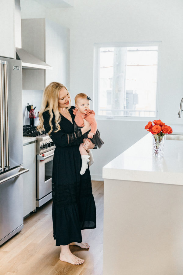
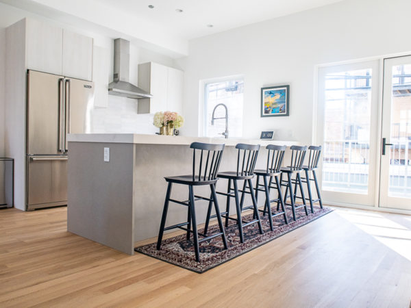
Since we committed to buying our home before construction, we got to pick all the finishes for the kitchen. We chose very light grey cabinets with wood grain and slightly darker textured grey cabinets for the bottom of the island.
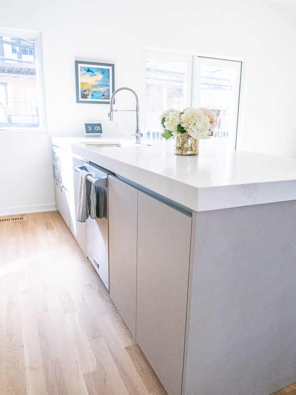
We selected white quartz with grey veining for the countertops. We went with extra thick quartz for the island, and I am so glad we chose this! It makes the countertops an even more prominent design element.
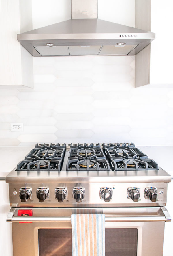
The backsplash is picket fence marble hung horizontally. It is the same tile that is used for the tile surround on the fireplace – but it’s hung vertically on the fireplace.
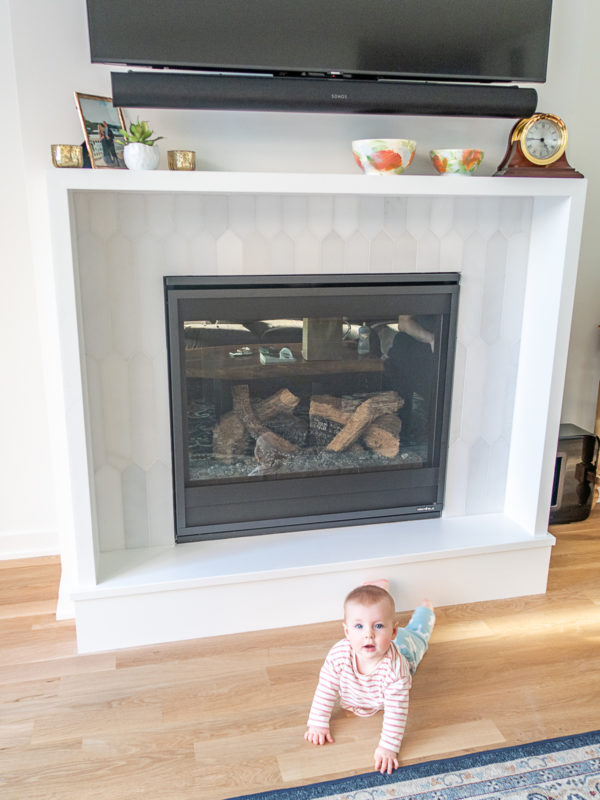
I love how this tile helps to tie the kitchen and living room together since these spaces have an open layout and are next to each other.
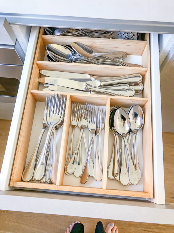
One thing that I splurged on, and that I highly recommend, was having custom drawer inserts made. We only have four drawers in the kitchen, so it was key that I make the most of them. They are awkwardly sized so none of the drawer inserts that I could buy at the Container Store or Target were the right fit. I turned to Etsy where I discovered Pop’s Peak View Workshop! Ed, who runs the Etsy shop, creates custom drawer inserts. I just needed to send him dimensions and to draw out what I wanted.
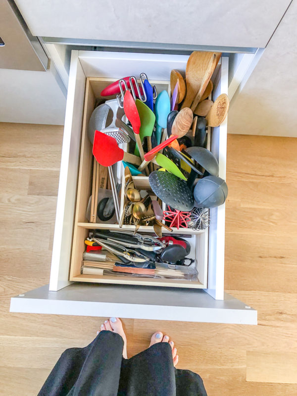
We have an extra deep drawer and Ed made a taller organizer insert for that drawer. I am able to store my spatulas, wooden spoons, whisks, and other kitchen tools each in their own dedicated cube of this drawer. The photo makes it look a little messy, but it’s totally organized.
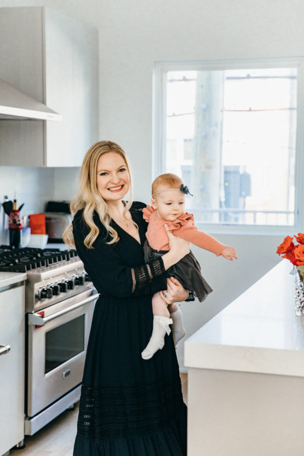
Making the most of the drawer space helps me to keep the countertops clear of clutter – a huge goal of mine. The kitchen drawers are something that we use constantly. Having the perfect organizational system for the drawers makes me happy.
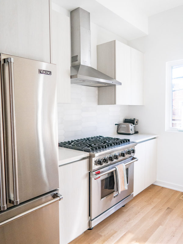
When I shared sneak peeks of the kitchen on Instagram, people noticed that this kitchen is smaller than our last. It is a bit smaller. It has a very different shape and about half of the cabinet space. On the plus side, it has an eleven-foot-long island instead of a six-foot-long one. And, there is a pantry around the corner with tons of space. Inspired Closets designed the pantry space – it’s perfect – and it more than makes up for the limited cabinet space in the kitchen. I will be sharing more on this later.
Just after Gwen was born, Charles and I went to meet with an interior designer to choose finishes for our home at a showroom. Prior to this meeting, I’d pulled inspiration photos from Pinterest, and Charles and I talked about a rough plan. We had discussed having a dark finish on the wood floors, just like we had at our previous homes.
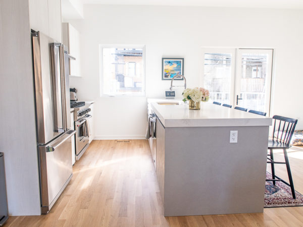
At the meeting, we changed our minds and decided to go with light oak floors. I was nervous about it! I called my Dad, who worked in flooring for a very long time, and he reassured me that it would look great. When I visited our home while it was still being finished, I got to pick the final stain for the floor from the samples that the team applied to the floor. I picked a clear matte stain. I absolutely love the final result. I think that the lighter floors make our home feel brighter and more spacious.
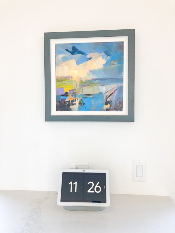
My only complaint about the kitchen was that the oven doesn’t have a clock. I looked at the clock on our oven at our last place all the time – I am always checking the time to keep Gwen on schedule. This problem was quickly resolved when our Google Home arrived. Its default screen is a big clock. We worked with Whiz Cribs to make our home a smart home, and I can control lighting, heating, and our doors, plus I can play Spotify and YouTube from this Google Home display.
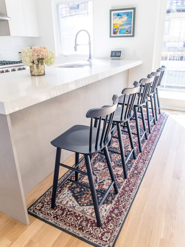
When it came to decorating the kitchen, I wanted to add color since the room has such neutral colors. First, I chose a runner from Ruggable. I picked Ruggable since their rugs are machine washable – and Gwen has a tendency to make a mess. The kitchen and living room are next to each other so I chose a coordinating rug for the living room.
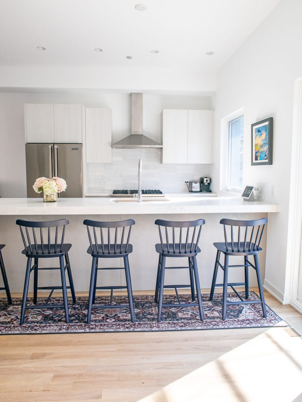
The counter stools are from Serena and Lily. I searched everywhere for counter stools and I love these. The pop of blue gives the space life. Plus, the stools are sold fully assembled which means that they are super sturdy. Even though they are solid wood they are lightweight. Most importantly, the classic Windsor design will never go out of style.
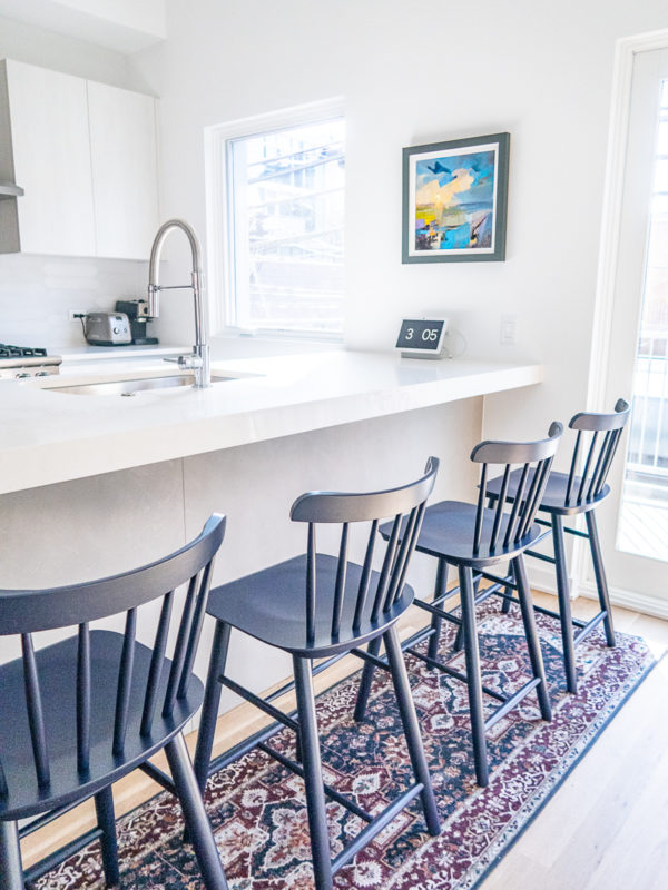
I bought the painting hanging above the island years ago at The Wey Gallery in Godalming, England. Remember when I visited all the towns where The Holiday was filmed? That’s how I discovered The Wey Gallery and the artist William Swayne. I love this abstract seascape – and luckily Charles does too (I bought it without running it by him). This painting just fits the space so perfectly and seeing it brightens my day.
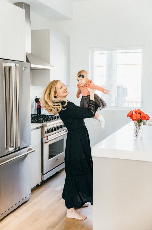
That’s the kitchen! I am so excited to share more of my home with you once I finish up a few projects.
