Sharing the kitchen design inspiration for our new kitchen!
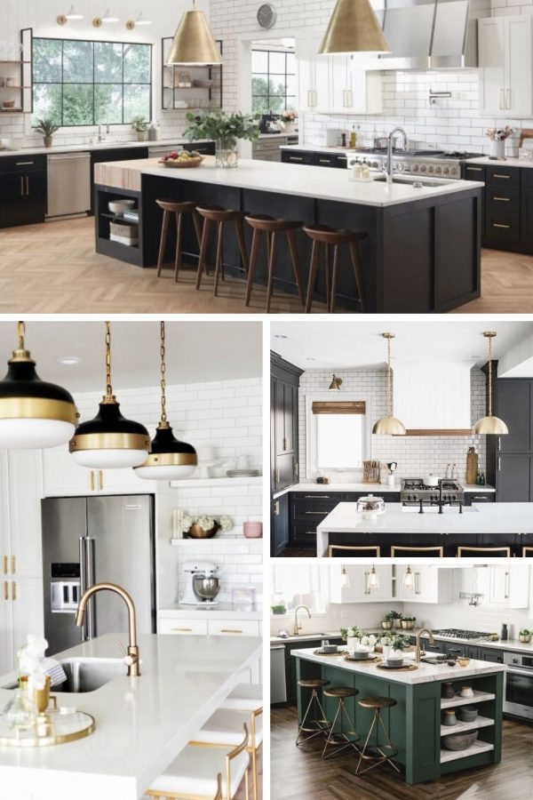
A couple weeks ago I shared that we are moving to a larger home in Wicker Park! Today, I am sharing some of the inspiration for our new kitchen. Since the home is new construction I get to pick things like cabinets, flooring, faucets, light fixtures, etc. I’ve never updated/designed a kitchen before, so this is a fun new project!
Obviously, the kitchen design is very important to me. It’s a space that I spend a lot of time in. Plus, the home is going to have a more open layout with the kitchen, dining area, den, and living room on the main floor – so the kitchen will always be on display.
Our New Kitchen
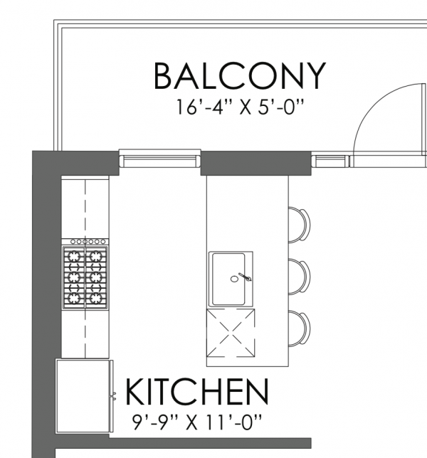
Here are the blueprints for the kitchen. We are definitely opting against having the wall dividing the kitchen and living room so we can have a more open layout. We are hoping that the bar can be extended too.
Charles had a great idea and told me to pull images from the Old Town condo that we had put an offer in on and didn’t get. Here it is:
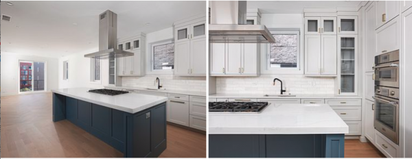
The kitchen had white cabinets and walls with a colorful island. We loved it in person and it’s a helpful point of reference.
Kitchen Design Inspiration
I made a point to pull inspiration images that have a kitchen layout that is similar to the one our new home will have.
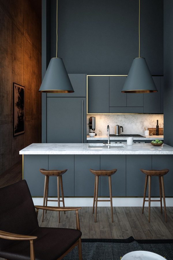
I am no interior design expert, but it seems that there are two big trends with kitchens right now: all white or bold color. Let’s take a look:
Bold Colorful Kitchens:
I love these kitchens, but I don’t know that we are ready to make such a strong commitment to one color.
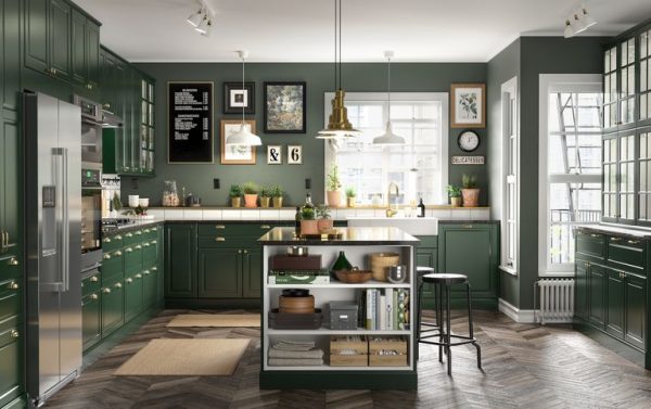
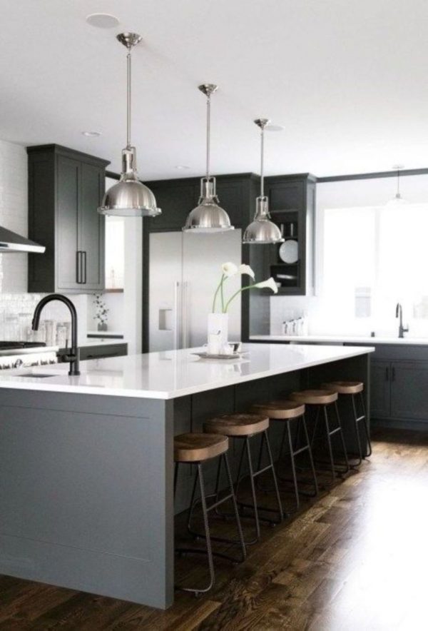
Pinterest is great because it makes it easy to type in “modern kitchen design” and instantly get lots of inspiration. But… at the same time, it can be really hard to find the original source of an image. After some internet sleuthing, I found a post on the Sand and Sisal blog that provides some more info on this design. All of the countertops are Cambria quartz in Newport.
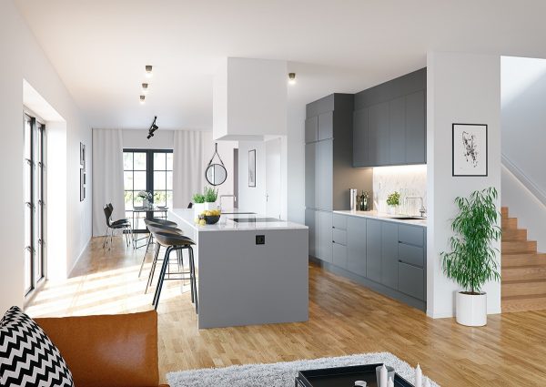
Chic All-White Kitchens:
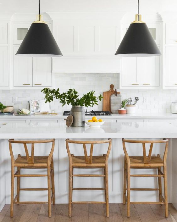
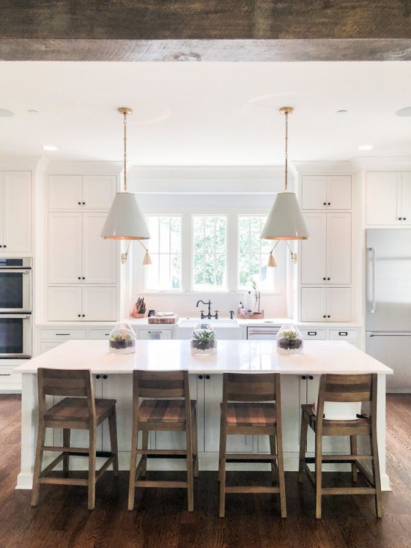
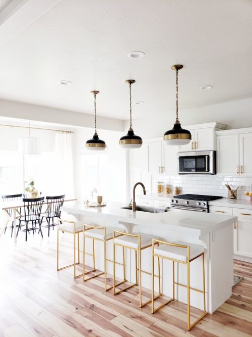
All white is appealing because these spaces seem so light-filled and spacious.
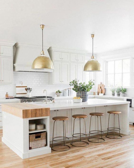
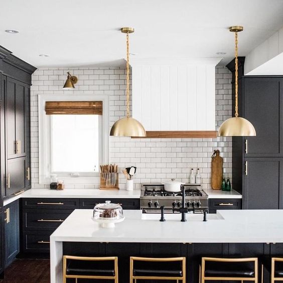
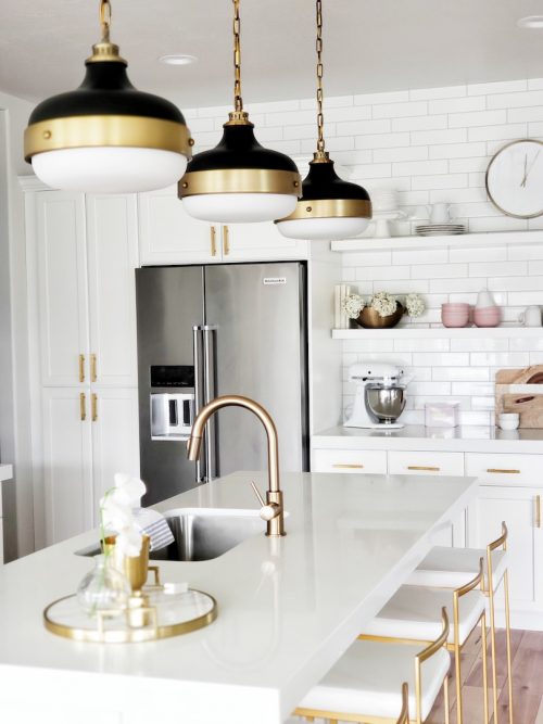
I really like the gold McGee & Co Eugene Pendant lights in this kitchen.
White Kitchens with Colorful Islands:
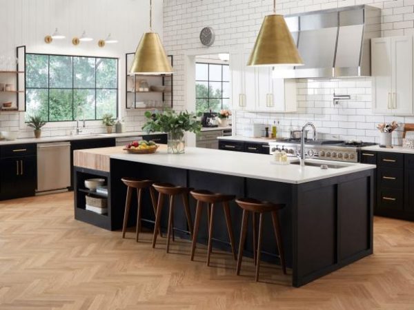
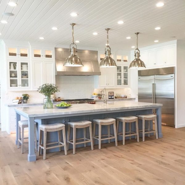
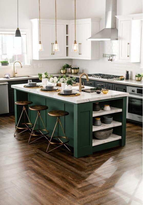
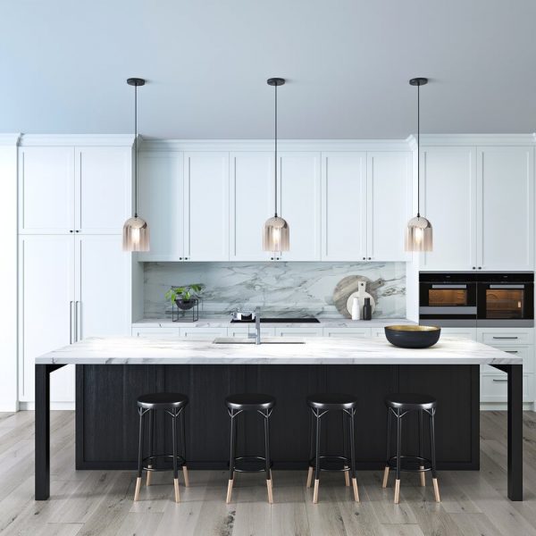
The middle ground is kitchens with white walls and cabinets, but colorful islands. I like this idea because repainting an island would be much easier than repainting cabinets if we wanted to make changes down the line.
Finishing Touches:
Another big decision is picking a color for light fixtures, faucets, and cabinet handles.
When it comes to all the fixtures, as of right now I picked chrome. Our current kitchen has stainless steel appliances and chrome fixtures and I like the streamlined look. But then, my friend Jenn revealed her kitchen with gold fixtures and stainless steel appliances and it’s gorgeous. Her kitchen is also a great example of a white space with some pops of color. Click over to Jenn’s site to see her kitchen.
Here is another example of gold fixtures paired with stainless steel appliances. It can really work well.
Those are the inspiration images, now we just need to make some decisions! If you have any kitchen design advice, please share in the comments!
